
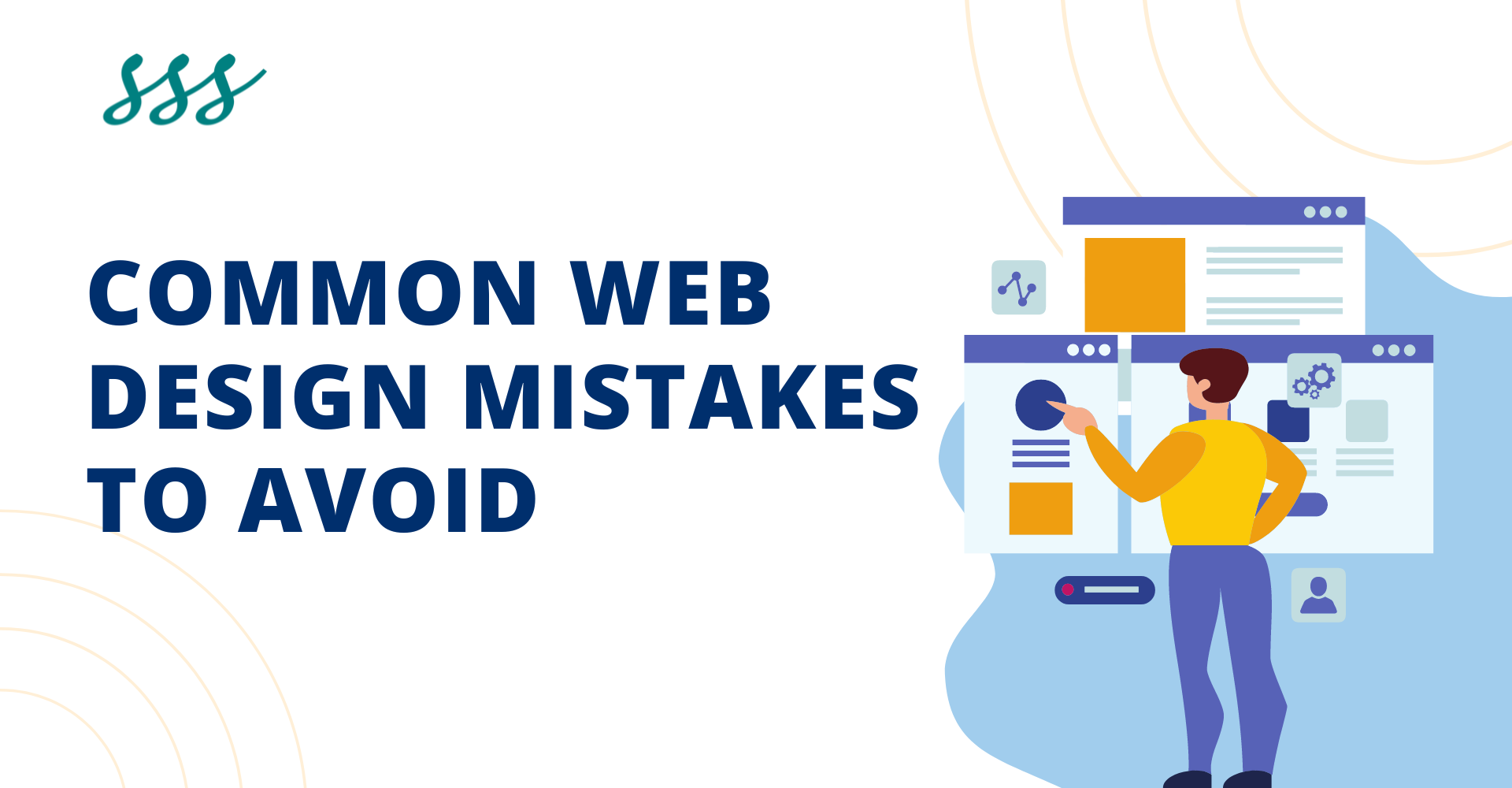
Most Common Web Design Mistakes to Avoid in 2024
Hey there, digital trailblazer! Welcome to the online universe, where your website acts as the ultimate ambassador for your brand or venture. Picture it as your virtual storefront, your calling card in cyberspace. Now, imagine this: you’ve put your heart and soul into crafting your corner of the web, only to find visitors darting off quicker than you can say “refresh.”
Sounds familiar? Fear not! We’re here to rescue you from the treacherous pitfalls of web design faux pas. Think of us as your trusty guides, navigating you away from the murky waters of cluttered layouts and confusing navigation. Instead, we’ll steer you towards the sunlit shores of user-friendly design, where every click feels like a warm invitation to explore further.
So, grab a seat and get comfy as we embark on a journey to transform your digital space into a welcoming haven that beckons visitors to stay awhile. Say goodbye to frustration and hello to web design success!
Top 10 Common Web Design Mistakes
Here are the top 10 web design mistakes explained in a user-friendly manner:
1. Cluttered Layouts:
Imagine walking into a room where everything is scattered around with no clear organization. That’s what a cluttered website feels like! It overwhelms visitors and makes it hard for them to find what they’re looking for. Keep it tidy and organized, like arranging your favorite things neatly on shelves.
2. Confusing Navigation:
Ever been lost in a maze with no map? That’s what navigating a confusing website feels like! Visitors should be able to find their way around easily, like following breadcrumbs through a forest. Clear labels and intuitive menus are your best friends here.
3. Slow Loading Times:
Waiting for a website to load is like watching paint dry—painfully slow! Visitors are impatient; they want information fast. Optimize your website speed, so it’s more like a speedy race car than a sluggish tortoise.
4. Ignoring Mobile Users:
Picture trying to use a giant spoon to eat soup—it just doesn’t work! Ignoring mobile users is like serving soup with a spoon too big for the bowl. Make sure your website is responsive and looks great on all devices, whether it’s a phone, tablet, or computer.
5. Poor Readability:
Ever tried reading tiny text on a billboard while zooming past in a car? Exactly! Poor readability on a website is like that—frustrating and nearly impossible. Use clear fonts, appropriate sizes, and colors that don’t strain the eyes, so visitors can easily digest your content.
6. Designing for Yourself:
Your website isn’t for you; it’s for your visitors. Don’t let personal preferences overshadow usability and functionality.
7. Weak calls-to-action (CTAs):
Weak calls-to-action (CTAs) represent another significant web design mistake that can hinder user engagement and conversion rates. When CTAs lack clarity, relevance, or prominence, visitors may struggle to understand what action to take next, resulting in missed opportunities for interaction and conversion.
8. Inconsistent Branding:
Imagine a McDonald’s with a purple arch—it’s confusing! Keep your branding consistent across your website for a memorable experience.
9. Overuse of Pop-Ups:
Like a pushy salesperson, too many pop-ups annoy visitors. Use them sparingly and strategically.
10. Ignoring Analytics:
It’s like driving blindfolded—how do you know where you’re going? Pay attention to analytics to understand what’s working and what’s not, then adjust accordingly.
By avoiding these common mistakes, you’ll create a website that feels like a breeze to navigate, leaving visitors impressed and eager to explore more!
Why It is Important to Avoid Web Design Mistakes?
Avoiding web design mistakes is crucial because your website serves as the digital face of your brand or business. First impressions matter, and a poorly designed website can quickly turn visitors away, resulting in lost opportunities for engagement, conversion, and revenue.
A well-designed website not only attracts visitors but also keeps them engaged and encourages them to explore further. By avoiding common design pitfalls such as cluttered layouts, confusing navigation, and slow loading times, you create a seamless and enjoyable user experience that fosters trust and credibility.
Moreover, in today’s competitive online landscape, user experience plays a significant role in determining a website’s success. Websites that prioritize usability, accessibility, and responsiveness are more likely to rank higher in search engine results and retain visitors for longer periods.
Furthermore, avoiding web design mistakes demonstrates professionalism and attention to detail, reflecting positively on your brand’s reputation and credibility. In contrast, a website riddled with design flaws can harm your brand image and drive potential customers into the arms of competitors.
Ultimately, by investing in thoughtful and strategic web design, you set the stage for long-term success, driving traffic, engagement, and conversions while building lasting relationships with your audience.
How to avoid Web design Mistakes?
Avoiding web design mistakes is essential for creating a compelling online presence. Here are ten tips to help you steer clear of common pitfalls:
Plan Ahead:
This initial step sets the foundation for a successful website by providing clarity on objectives, target audience, and key features. Planning ahead allows designers and stakeholders to align their vision, ensuring that the website effectively serves its intended purpose.
By defining clear goals, whether it’s to showcase products, generate leads, or provide information, designers can tailor the website’s design and functionality to meet those objectives. Understanding the target audience is equally crucial, as it enables designers to create a user experience that resonates with visitors’ needs, preferences, and behaviors.
Furthermore, outlining key features early in the planning process helps prioritize development efforts and allocate resources effectively. Whether it’s integrating an e-commerce platform, implementing a blog, or incorporating multimedia elements, having a roadmap from the outset prevents unnecessary delays and ensures a more streamlined development process.
Keep it Simple:
By reducing complexity and clutter, designers can enhance user experience and facilitate easier navigation. Simple layouts, intuitive menus, and concise content ensure that visitors can quickly find what they’re looking for without feeling overwhelmed or confused.
Moreover, simplicity extends to visual elements, with clean aesthetics and uncluttered interfaces fostering a sense of calm and professionalism. Striving for simplicity not only improves usability but also conveys a sense of sophistication and clarity in communication. By adhering to this principle, designers can create websites that are not only visually appealing but also highly functional and user-friendly, leading to greater engagement and satisfaction among visitors.
Optimize for Speed:
Fast-loading websites not only keep visitors engaged but also contribute to higher search engine rankings and increased conversion rates.
To optimize for speed, designers focus on several key areas, including minimizing file sizes, leveraging browser caching, and reducing server response times. Additionally, optimizing images and videos, employing content delivery networks (CDNs), and using efficient coding practices all play vital roles in enhancing website speed.
By prioritizing speed optimization, designers prioritize user satisfaction, as slow-loading websites frustrate visitors and increase bounce rates. Moreover, with the growing prevalence of mobile browsing, where users expect instantaneous access to information, speed optimization becomes even more critical. Ultimately, a fast-loading website not only improves user experience but also reinforces brand credibility and positively impacts business outcomes.
Embrace Responsive Design:
Responsive design ensures that websites adapt seamlessly to different viewport sizes, providing a consistent and optimal viewing experience across desktops, laptops, tablets, and smartphones.
By adopting responsive design principles, designers prioritize flexibility and adaptability, allowing content to reflow and adjust dynamically based on the user’s device. This approach eliminates the need for separate mobile versions of websites, streamlining development and maintenance efforts while ensuring a cohesive brand experience across all platforms.
Moreover, responsive design contributes to improved SEO performance, as search engines favor mobile-friendly websites in their rankings. With mobile usage surpassing desktops, embracing responsive design is not just a best practice but a necessity for engaging and retaining users effectively. By accommodating diverse user preferences and behaviors, responsive design enhances accessibility, usability, and overall user satisfaction.
Focus on Readability:
Clear and legible typography, appropriate font sizes, and sufficient contrast between text and background all contribute to improved readability.
By prioritizing readability, designers enhance the user experience, making it easier for visitors to consume content without straining their eyes or becoming frustrated. This is especially important considering the diverse range of devices and screen sizes used to access websites.
Additionally, optimizing readability positively impacts user engagement and comprehension, leading to longer visit durations and increased retention of information. Designers may also consider factors such as line length, spacing, and paragraph structure to further enhance readability and flow.
Test, Test, Test:
Through thorough testing, designers identify and address potential issues, ensuring a seamless and enjoyable user experience.
This iterative process involves testing the website’s compatibility with different browsers, screen sizes, and operating systems to uncover any inconsistencies or compatibility issues. Additionally, usability testing involves observing real users as they interact with the website, providing valuable insights into navigation, content comprehension, and overall satisfaction.
Regular testing allows designers to catch bugs, optimize performance, and refine user interfaces, ultimately improving the website’s effectiveness and user engagement. Moreover, ongoing testing ensures that the website remains functional and relevant as technologies and user expectations evolve over time.
Seek Feedback:
Feedback can come from a variety of sources, including user surveys, usability testing sessions, and informal discussions with stakeholders. By actively listening to feedback, designers can uncover pain points, address usability issues, and refine the website’s design and functionality accordingly.
Moreover, involving stakeholders in the feedback process fosters collaboration and ensures that the website aligns with organizational goals and objectives. Ultimately, seeking feedback helps designers make informed decisions, prioritize enhancements, and create a website that meets the needs and expectations of its intended audience.
Stay Updated:
Keep abreast of emerging trends, technologies, and best practices in web design to ensure your site remains relevant and competitive.
Iterate and Improve:
Regularly review and refine your design based on analytics data, user feedback, and evolving business needs to continuously enhance your website’s effectiveness and user satisfaction.